Powered by Blogger.

Followers

Showing posts with label decorating tips. Show all posts

How high do you hang your curtains, and what about that space?

Sunday, November 14, 2010


THIS POST IS FROM ROOM REMIX - THE BLOG Veranda photo Tria Giovan

I used to get questions a lot when I was decorating on how high to hang curtains. My opinion always was:
  • Higher is better.  It adds height to the room and more presence to the windows.  I also like them hung off to the side with the inside edge of the panels just covering the inside of the window casings because it makes the windows appear wider and allows more light in.
myhomeideas.com Lisa Romerein

Here are some opinions from other sources:
  • Southern living - "Hang your drapes high. To create the illusion of a larger room, hang your drapery rod just below the ceiling rather than right above the window frame. A higher rod draws the eye up and allows more light to come in. If the ready-made curtains you love aren’t long enough, add a simple band of fabric in your accent color for a custom look that costs a lot less."
  • From Canadian House and Home's How to Hang Curtains - "For standard drapes that hang on either side of a window creating a frame, the typical height at which to install the drapery rod is halfway between the top of the window and the ceiling. This applies if there are more than 12 inches between the window trim and ceiling. For a cathedral ceiling, try to leave approximately 4 to 6 inches above the window trim as a guideline. If your ceiling is low, consider installing the rod as close to the ceiling or crown moulding as possible. In a small room, hanging drapery panels as high as possible will give the illusion of extra height."

I think it also works well, and feels more cohesive, to hang all of the curtains at the same height, even if the windows are not...
myhomeideas Photo Tria Giovan

Many times hanging the treatments higher is not that much of a stretch because the window is fairly close to the ceiling.  myhomeideas


But other times there is a space between the top of the window and the rod.   Almost every time I would suggest curtains be hung higher than the window (without a top treatment) when the ceiling wasn't in close proximity, I would get the question "but what about that space?"

I think it's fine to leave the "empty space", but in case it bothers you, here are some ideas.

Colour Confidential

A cornice board is an option everyone is probably familiar with...
Colour Confidential

I don't know if the shades in the next two images (from Amanda Nisbet and Phoebe Howard) are functional or not, they probably are, but it's a good visual on how it would look to make a faux roman shade to fill the gap.    Sunset shows you how to make them here.


We've already seen this image from bhg.com in this post. In it, they've used a mirror to fill in the space. I admire the idea although the fact it reflects the chandelier makes it feel a little busy for me.


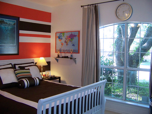
Cassie at Hi Sugarplum, put a clock in the blank space in her son's bedroom makeover.


GCI Design used artwork...

Kimba at ASPTL wasn't talking about curtains in this post,  but she did talk about what she puts above her doors and windows.  Any of these ideas would work!

I saw on a TV show some time ago (I think it might have been Colour Confidential/Get Color, but I looked for it on their site and couldn't find it - which is how I ran across the other images!)   They hung the window treatments at ceiling height and then painted the space between the top of the window and the rod in a darker shade of the wall color.  It looked great!  Wish I had a visual for you, but if one of you try it I hope you'll send me a photo.

What's your opinion on curtain height?  Also, are you a space filler or fine without? Any creative ideas that you've used above your windows?  Have I asked enough questions yet? :-)

A quick tip about color and contrast

Monday, November 8, 2010


THIS POST IS FROM ROOM REMIX - THE BLOG .

The bedroom above was just one of the rooms in art teacher and painter Ellen Small's home that was featured in this month's issue of Traditional Home.

It's a pretty room with it's light blue walls and breezy bed curtains, but my eyes were immediately drawn to the artwork above the bed. Why? Because our eye is drawn to color and it's the most intense color in the room, in high contrast to the walls. This intense pop of color further establishes the bed/artwork as the focal point of the room. If similar artwork were on other walls in the room (which it may very well be, we just can't tell from this view point), this artwork would lose some of it's impact. That would be fine, too, it's all in what you're trying to accomplish.

THE TIP(s):

  • If there is something in the room that you want to highlight or make a *focal point, using contrast and color is one way to make sure it gets noticed.
  • In the reverse, if you're not particularly fond of something and don't want people to notice it the minute they walk in the room, neutralize it. Make it blend in with it's surroundings. (For instance, if you had an old and worn chair that you're just not in a position to replace or slipcover yet but it's attracting attention because it's the brightest, most colorful piece in the room, covering it with a throw that was closer to the wall color would help it blend in and instantly become less noticeable. -- Adding more items around the room in that same bold color would be another way to take the focus off of the chair.)
  • Lack of contrast is also a trick that can be used in small rooms. If the major furniture pieces are very close to the wall color, the room feels larger because there's no real contrast between the two.

*Want to know more about focal points? I'll be talking about them in an upcoming post.

Photo by Joe Schmelzer

Get the big swatch and take it home...

Wednesday, October 13, 2010


THIS POST IS FROM ROOM REMIX - THE BLOG .

One of my friends recently asked me to meet her at a flooring store because she was trying to pick out carpet and wanted my opinion. When we arrived, the sales consultant took out the big book of miniature swatches that they had been looking at and they asked which one I would choose. My answer was "none!".

I would never make a final decision on carpeting or paint (or fabric for custom upholstery/window treatments, for that matter) without seeing it in a larger swatch in the room that it would be installed in. I'm sure there may be people that do, but I just think it's too risky.

No matter how sure I may be that I'm in love with it in the store, what I see standing there looking at a miniature swatch under fluorescent lighting is different than what I will see in a larger swatch at home. I think it's a good idea to keep any swatches for a few days and look at them as the light changes throughout the day/evening.

When it comes to paint, I paint a large piece of poster board with at least two coats so that I'm sure I have a better sense of the true color and then move it around the room for a few days to see what I think (that is unless I paint the board and immediately know I hate it - that's definitely happened!)

How about you? Take it home or choose it in the store?

The Pattern Inspiration Linky Party will be up through Thursday night so there's still time for you to link up if you'd like. Thank you to those who already have! It's been fun seeing your inspiration.

images - Traditional Home

Area Rugs/Window Treatment - Questions Answered

Saturday, February 27, 2010


THIS POST IS FROM ROOM REMIX - THE BLOG .

Phoebe Howard

There were a couple of questions on the "Large Impact vs. Small Accessories" post, so I thought I would answer them in a post in case some of you had the same questions. As with anything I talk about on this blog, these are my opinions based on my experiences, what I've been taught, and personal preference. I've learned long ago that my opinion is not the only one and that I'm not the source of all wisdom and knowledge, so if your opinion or experience varies from mine, I'm cool with that. :-)

QUESTION 1: Do you think it'd be too boring to do solid colors for both the windows and the rug?
ANSWER: There are many successful rooms that are done using solid colors for both the window treatments and the rugs. I've shown one example at the beginnning of this post. One way to avoid being boring, if that's a concern, would be to add trim to the window treatment and use a very textural rug as they did in the room below. If you're not a fan of pattern OR color, even very neutral rooms without much pattern can be made interesting just by using a variety of finishes and textures. This room by Phoebe Howard is a great example of that.

Southern Living via myhomeideas.com Van Chaplin; Charles Walton IV

QUESTION 2: How do you feel about rugs on top of carpet? I love a rug on a hardwood or tile floor but not sure about on carpet.
ANSWER: If your space needs an area rug to add a different texture, define a seating area, pull some colors together or add color that doesn't exist, it doesn't matter to me if it's hardwood or carpet, you still need it. The rug in the living room below doesn't look expensive and it's not some totally unique pattern or color, but imagine the room without it. It really defines the seating area and the slightly darker color grounds the space.

myhomeideas.com Photo:IPC Images

QUESTION 3: Are they a pain to vacuum around and under when they're on carpet?
ANSWER: I have an area rug on my carpet in my family room and I've never had any trouble vacuuming on, under or around it. A carpet pad will help keep thinner rugs in place.

House Beautiful Photo: Jose Picayo

Hope you're all having a great weekend!

Looking at Your Space In A New Way

Sunday, January 10, 2010


Just a simple, but very useful, tip today. I've used it for quite a few years now, but it really never occurred to me to post about it until Janell and Danielle did. In case you haven't already seen their posts, here it is.

If you're wondering what your room REALLY looks like, take a picture. When I first started decorating I always took photos of clients rooms so that I would have them in their file if I needed a visual on something. I realized it also gave me a little different perspective than what I had standing in the room. Before too long, I started using it on my own spaces when I was trying to figure something out. It really works! I try to fake myself out and pretend like it's someone else's room so that I can really look at it objectively, and I'm always amazed at how much better of a handle it gives me on what's not working and what is. Try it!

Speaking of taking pictures... I'm hoping to have my post up sometime on Monday with the changes we've made so far to the closet craft room.

Have an awesome day!

Accessorizing Your Walls - Crunching Some Numbers

Monday, November 16, 2009


myhomeideas.com

In all of the homes I’ve visited in my life, very seldom have I seen art that’s hung too low, but I’ve seen a lot that’s too high. I’m tall, so eye level for me is a smidge over 67”, and I’ve seen a fair amount of art hung above my eye level by a ways. So I'm sure you can guess what the next tip is...

#2: Don't hang your art too high - In general, if you put the center of your art, mirror or grouping somewhere around 60" high it should work out pretty well. Some of you have probably heard advice to hang it at eye level, but since that is quite variable, around 60" is a good average height. If the art is in a room where you're seated most of the time, that number can be fudged down even more.

myhomeideas.com

When you're hanging art above furniture, you want it to relate to what is below so approximately 6" or so above the furniture is a good rule of thumb.
Southern Living Photo Charles Walton IV

#3: Art or groupings that aren't wide enough may end up looking a little lost on the wall. If you're looking for a guideline that you can use for width above furniture, shooting for at least 2/3 - 3/4 of the furniture width will work. This can vary above buffets, etc. where lamps and accessories fill in the gaps.

Country Living Michael Luppino

These guidelines should help you avoid art that's just floating in the room as if it doesn't belong, and a space that feels slightly disjointed.

If your space is feeling a little out of sorts, maybe the solution is as simple as moving your wall art/mirror/grouping down a little? If you try it and it works for you, I would love to hear about it!

EDIT: Hooking up to Julia's HOOKED ON HOUSES link party - check it out!

Accessorizing Your Walls - Work With the Shape of the Space

Sunday, November 15, 2009


As I was working on this, I realized that one post could turn out to be very long and possibly a little overwhelming so I decided to break it up. Tuesday's post will NOT be about accessorizing your walls but, other than that, I'll do as many posts in a row as I need to say what I want to say about the topic. I guess some would call that a series :-)...

You've also probably seen all kinds of room photos from designers that have not followed some of these guidelines (I've probably shown some of them on this blog), but we're not going to go there. What I'm sharing with you are very basic in-the-box principles that aren't new, but some that I've learned and used successfully that will help you to get it right without guesswork, or necessarily having to have an "eye" for design or art placement.

#1 - Follow and work within the general shape of the space you're accessorizing.

For example, I typically view the space above a sofa as a large rectangle. With that in mind, these first two don't work...
(the first one may seem extreme, but I've seen it many times - random art placement - we'll cover this in another post in this "series")


While these two definitely do...


So before you accessorize your wall, analyze the shape of the space first... What is it? A square? Rectangle? Triangle? Once you've analyzed the space there are a bajillion (not a word, but I like it) ideas for what you can put IN the space and how you can arrange it and still be within the basic framework, but defining it is step one.

Since my examples don't really have much of a pretty factor, I thought I would end with this bedroom by Phoebe Howard which also demonstrates art fitting, not fighting, the space.

Little plants in containers...

Wednesday, November 11, 2009


It's been a while since there has been some action here on 'Rang Decor', so today let me make a start:-)

This post is in response to a query by one of Rang Decor's readers about plants in containers.
I love plants. I love plants that I can bring into my rooms and that enlivens each and every corner.

Rather than just place the plants as it is, I like to place them in little ceramic mugs/bowls or brass vessels or cane baskets. Try it and you'll see how beautiful the space becomes:-)

Here are some interesting arrangements at home.


Do share any other interesting arrangements you do with your house plants:-)
Happy decorating and have a great day!

Creative Decorating Tips and Ideas

Thursday, September 3, 2009


realsimple.com
Varying the tones/tints/shades of a color and adding texture and pattern ensures that your monohuematic (using just one color) color scheme won't be monotonous!


The photo above may be a little too much of a good thing, but using empty frames on shelves, mantels or in a wall display creates unique graphic visual interest.


Trying to think of a way to make your flat panel TV less of a dominant feature? Think of how many ways you could improvise on this idea. If you're interested in creating the sillouhettes shown here though, more information is available here diyideas.com

Enjoying Your Photos: If you're like me (not a scrapbooker) and have old photos stashed away in cabinets, why not purchase a large decorative bowl, basket or tray for the coffee table in your family room and put all of the loose photos in it? It's a good conversation starter and a nice way to be able to enjoy your photos when you're just hanging out. (I already know that the mom's with little ones who constantly have sticky fingers are questioning this idea, but I had to bring it up. :-))

Have a great day!
 

Most Reading