THIS POST IS FROM ROOM REMIX - THE BLOG .
There was enough interest in the first
TV Gallery Wall post that I did, that I decided to do a second one to answer some questions and provide you with more examples. I've included some images that aren't actually TV gallery walls, but just add a TV and they could be!
Here's my two cents on the topic...
1. How do I choose art for my gallery wall? This is completely personal preference. There are those who like to have a theme to their art, or at least a few related pieces within the gallery, and then those that will tell you the more unrelated the better for a more eclectic feel. The trend right now seems to be moving to more collected and eclectic.
But if you're more comfortable with something that has a theme (such as family photos) and matched frames that's a great look too! (Notice though that varying the sizes of the frames, mixing horizontal with vertical, and not having a uniform outside edge to the gallery adds a lot of interest to this grouping).
2. Mixing frames of different shapes and sizes makes the gallery more interesting and natural looking. Repeating one of the points above. Pretty self-explanatory, but worth repeating. Also, if you have a small wall like this, why not completely fill it like they did? Makes much more of a statement.
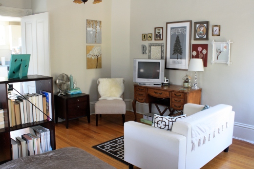
3. Hang your art (and TV) at the right height. As I mentioned
in this post, art that's hung too high drives me a little crazy, and it seems to be one of the things that many people struggle with.
The main thing to remember is that it needs to RELATE to/be part of what it's being hung above or to the space that it's in, NOT to the ceiling. :-)
As your eye moves around the room, it shouldn't have to go completely out of it's way to take in the artwork. |
| Erinn Valencich via HGTV |
If you're hanging the TV on the wall (without furniture beneath), then a good rule of thumb is that the CENTER of the entire grouping, including the TV, should be somewhere around 60". Because you're generally seated in a living/family/media room this number could be fudged down even more. Remember it doesn't mean that the center of the TV has to be at 60" - the TV should be hung at the best height for viewing, so we're talking about the center of the entire gallery (remember art can be hung under the TV too as part of the gallery - no rule against that).
If your TV is sitting on, or hanging directly above, a console, hanging your art approximately 6" or so above the furniture is a good rule of thumb.
4. Accessorizing the TV console is a great way to soften the transition between the wall and the furniture. 5. You're not trying to hide the TV. To me the purpose of creating a TV gallery wall is not to "hide" the TV, but rather to make the wall so interesting that the TV is not necessarily the focus. I don't think you have to include artwork or frames that match the TV, but common sense tells you that the more the TV color is repeated the less obvious the TV itself will be. Again, personal preference.
6. Size matters. How large your grouping is really depends on how large the wall is, the size of the TV, the size of the console if it's sitting on one, etc. DO take scale into consideration. If your TV is large, don't put a couple of puny frames around it and call it a gallery wall. :-)
7. Keep spacing between the artwork/frames/items fairly standard. This will keep it looking like a gallery rather than just a hodge podge of randomness hung on the wall. No exact rule, but I think somewhere between 2 and 5 inches is a good rule of thumb. Again, whatever measurement you decide on, just keep it consistent.
8. Get creative. Have fun with your gallery wall. Use your creativity. Think outside the box. Frames and artwork are an obvious choice, but why not choose a different theme or mix other items in with your framed artwork or photos?
Dave and Joi at
Nuestra Vida Dolce used ceiling medallions to make a statement behind their TV.
____________________________________________A couple more ideas of how to incorporate the TV into your design...
This really isn't a gallery wall either, but I just thought it was so cute. If you want to know how to build the trees, click on this:
Plywood Tree How-To and Pattern____________________________________________If you're interested in setting your TV into the wall with a niche, check out HGTV's
How To Build Wall Niches:
If you've created a gallery wall, I would love to see pictures of your project!